Posts

Showing posts from 2017

Carolee Schneemann

Image
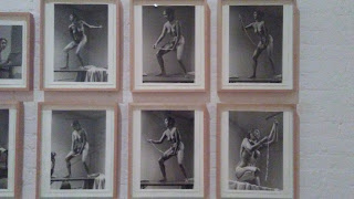
"Interior Scroll, (1975/77)"      I think Carolee Schneemann's "Interior Scroll" piece has got to be the most darnest piece of art I've ever came across. It was disturbingly intriguing. In this piece, Carolee uses her own body to symbolize gender politics and empowerment and in her own words, calls "the movement" of interior thought to exterior signification," where this piece of art gave visual forms to her notion of vulvic space. For this artwork, she is on a table, naked and she has painted her face and body with mud and like this, is she slowly taking out this scroll from her vagina while reading out the manifesto printed on it. I personally believe her performance with her reciting the manifesto was very symbolic in terms that she perceived her vagina as not only a birth passage, but the source of knowledge. Schneemann's interest was so high in the vulvic space because she thought of is as this passageway  "from the vi

Waste Land

          The film “Waste Land” by Vic Muniz was an extraordinary film that revealed and proved that art can truly change peoples’ lives. In this film, Vic Muniz’s idea on taking garbage; useless or unappreciated items, and making it into art, changed not only his life in such a positive way, but it also changed the lives of 6 people and ACAMJG community. Before I move forward, a little background on Vic Muniz and how this huge project of his came to be. He was born into a working class family in Sao Paulo, Brazil. In his earlier days, he was shot in the leg and after all that commotion; he came to New York City where he worked. First he began his career as a sculptor but then gradually he became interested in photography. He became so interested in using garbage, dirt, diamonds, sugar, strings, wire and syrup as the main use in his art that he just had to travel to Brazil’s ACAMJG (the Association of Recycling Pickers of Jardim Gramacho).             In ACAMJG, you’ll find the most

Damian Ortega in "Mexico City"

Image
Damian Ortega is a very fascinating Mexican artist who uses everyday life materials in his art, for example, Volkswagen Beetle cars, Day of the Dead posters and locally sourced corn tortillas (which I found to be hilarious). His work explores specific economic, aesthetic and cultural situations and, in particular, how regional culture affects commodity consumption. Damian always was fond of art but by watching his brother, who liked to do a lot of experiments and take apart kitchen appliances to see how they work, he then branched out his ideas to taking common materials apart. For example, on the bottom right corner is a picture of "Cosmic Thing," a beetle car was used for this specific type of art because for one, he had his own, secondly it was part of his own family, and thirdly because it was the most popular car in Mexico City. This exploded installation gave this vibe that every piece, every part of the beetle car had it's own life and it&

MoMa Essay

Image
Marcel Duchamp  In Advance of the Broken Arm August 1964 (fourth version, after lost original of November 15, 1915)      I found this piece of art to be very funny, strange but interesting as this shovel free-hangs from the ceiling by a strong wire. At first I didn't understand at all how this was art, but then remembering that Marcel Duchamp's art revolved around Surrealism, it started to get to me. Surrealism art made people use their imagination, making them think outside the box about everyday life objects and just to basically awake the unconscious mind of the people. Also influenced by Karl Marx, surrealism tries to reveal this contradiction in the everyday world and I agree with this because this piece of art, In Advance of the Broken Arm , already brings this contradictory ring to it. This shovel was just one example of Marc Duchamp's many "readymades" sculptures. He believed that selecting mass-produced functional objects and going against t

Postwar Modern Movement

Image
Dada Collage " Burger Fish "

Early 20th Century

Image
EDWARD WESTON (1886-1958)       Edward Weston was one of the great American photographers who revolutionized and modernized photography in every sense of the world.  Whether photographing elemental landscapes, sculptural nudes or everyday objects, Weston's brilliance was allied to a democratic approach to his subject matter. Edward's interest of style fell first into mechanical imitations of painting styles, but soon he became restless with pictorial-ism, which took inspiration from impressionism and symbolism. In time though he found a new sense of style that fit his taste in photography and that was constructivism and cubism. Constructivism was a style or movement in which assorted mechanical objects are combines into abstract mobile structural forms and then with cubism, Edward abandoned the use of single viewpoint and within his photos showed simple geometric shapes. Also he focused on realism, which for Edward he was more focused on the meaning behind the object him

Impressionism and Post-Impressionism

Image
Claude Monet's painting "Impression, Sunrise," depicts an impressionism type of artwork. As it can be seen, Monet paints a beautiful sunrise on the port of Le Havre, his hometown. Claude Monet decided to name this artwork "Impression, Sunrise" due to his hazy painting style in his depiction of the subject.  The imagery of this work of art presents a focus on the calm feeling of a misty maritime scene.  Slightly below the center of the painting, a small rowboat with two indistinct figures floats in the bay.  The early morning sun is depicted rising over the foggy harbor with ships and other various boats at port.  The shadows of the boats and figures and the reflection of the sun’s rays can be seen on the water’s surface.  Monet incorporates a palette of mostly cool, dull colors into the painting with blues and grays, but also includes splashes of warm colors noticed in the sky and the red-orange sun.  This usage of a noticeably bright color draws attention t

Renaissance & Baroque Art Assignment #3

Image
Renaissance Artwork Filippino Lippi's Madonna and Child One beautiful piece of artwork that I saw at The Metropolitan Museum of Art was Filippino Lippi's "Madonna and Child." Filippino Lippi is from Italy and he painted this beautiful artwork around 1485 for a wealthy banker named Filippo Strozzi. This painting is also held up with a stunning golden thick and well-designed frame. This painting shows the Madonna and Child seated inside a closed area, with a view of the landscape with a river through a window. Lippi definitely put a lot of work into this painting as it can be seen with the details of the still life and landscape view. What attracted my attention so much was the vibrant colors that he used. Complementary colors are definitely shown here with the bright blue and yellow and then red with green. This ultramarine blue was used in this painting in particular because Strozzi valued material display and insisted that his paintings had that specific c

Design Elements and Principles HW #2

Image
 "Unity is the appearance or condition of oneness in design. It describes all the elements in a work, belongs together and make up a coherent and harmonious whole." 1. Several ways that artists use to unify their work are by using line, shape and color. Repetition of vibrant colors and geometric shapes also contribute to the unity of the artwork. For examples, Marc Chagall's "I and the Village" painting, many vibrant colors are repeated throughout the artwork as well as geometric shapes. The use of implied and psychic line  make it very easy and clear to see the figures portrayed. A goat is show on the left side of the painting and Marc Chagall himself , on the right side. Also the psychic line makes a clear vision of a road and where the road directs to as a man is painted on the road walking upwards. The use of all these techniques creates unity in one painting and the title of this artwork could be easily understood. 2. Asymmetrical balance is when th

Online Homework #1: HarmonIntroEgyptianGreek

Image
     After watching the video, I learned many new and interesting things between Egyptian and Roman and Greek art. It was fascinating to know that withing each era, there were many types of symbols that connected with each culture and even though the time frame of Egyptian and Roman and Greek art are so part apart, there, lies many similarities and differences between them.      Let's start off with the differences between the three. All types of arts are beautiful but it's qualities is what makes them stand out from one another. Egyptian art could be easily identified with their hieroglyphics, animal symbols such as the Bastet (cat), falcons, cobra, jackals, hippos, etc., and the positioning of the figures. Hieroglyphics is a writing system that the Egyptian people followed and on many their arts, there would be hieroglyphics to tell out a story. Each animal that is sculpted in Egyptian art means something. For ex., the Bastet symbolizes divine powers (protector, ferti

A little something About Me !

Hey guys, Geraldine here! Here's some things about me ^_^  School of Study: LaGuardia Community College Major: Nursing Age: 19yrs Hobbies: Sing, draw, listen to music, play various sports Love: Food, going out on adventures and taking pictures Hate: Drama, mint chocolate chip ice cream, anything that has to do with horror! Dream: Travel around the world with my loved ones! Experience in Art I've been involved in various types of art classes and in those classes I've done pencil drawing, graffiti, water-coloring, pastel, acrylic painting and collages. My most favorite type of art technique is water-coloring because I love the way the colors can diffuse and blend in with one another so amazingly. When the water colors are all dried up, I like to go over it with a black pen or a sharpie pen creating a drawing right on top.